
Seewes – Rice Crisps
About the project
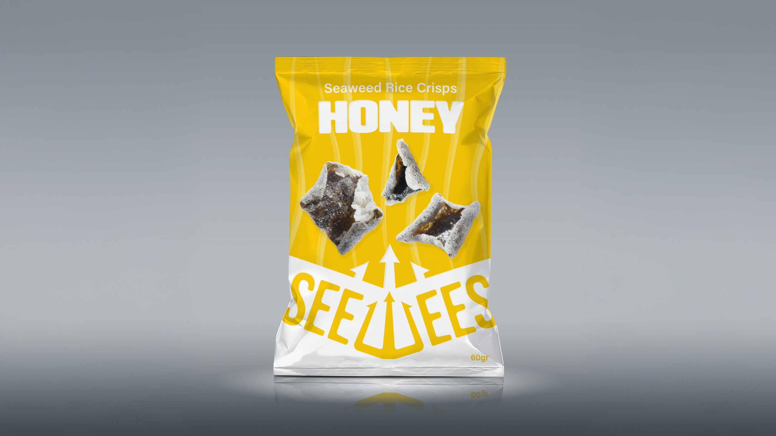
Seewees is a fictional rice crisp brand designed to appeal to the widest possible audience while remaining modern, unique, and visually engaging. The design direction focuses on simple, eye-catching, and informative packaging that makes no compromises. I emphasized the rice crisp imagery on the pack by incorporating three arrows emerging from the logo, drawing attention to the product itself.
The logo was inspired by the sea, the typeface is soft and slightly wavy, evoking the look and motion of seaweed. The “W” in Seewees has been cleverly transformed into a trident, hinting at the brand’s oceanic origins. Finally, bold, oversized flavor text and distinct color variations make it easy for customers to spot and select their favorite pack from a distance.


