NF – Magazine
About the project
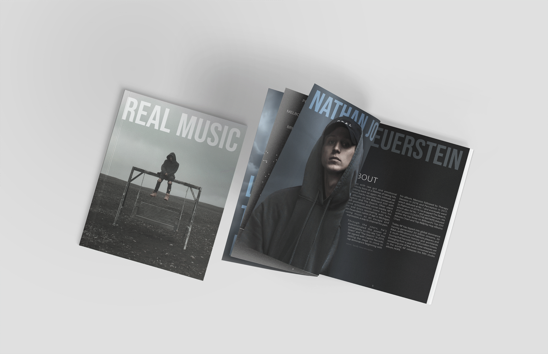
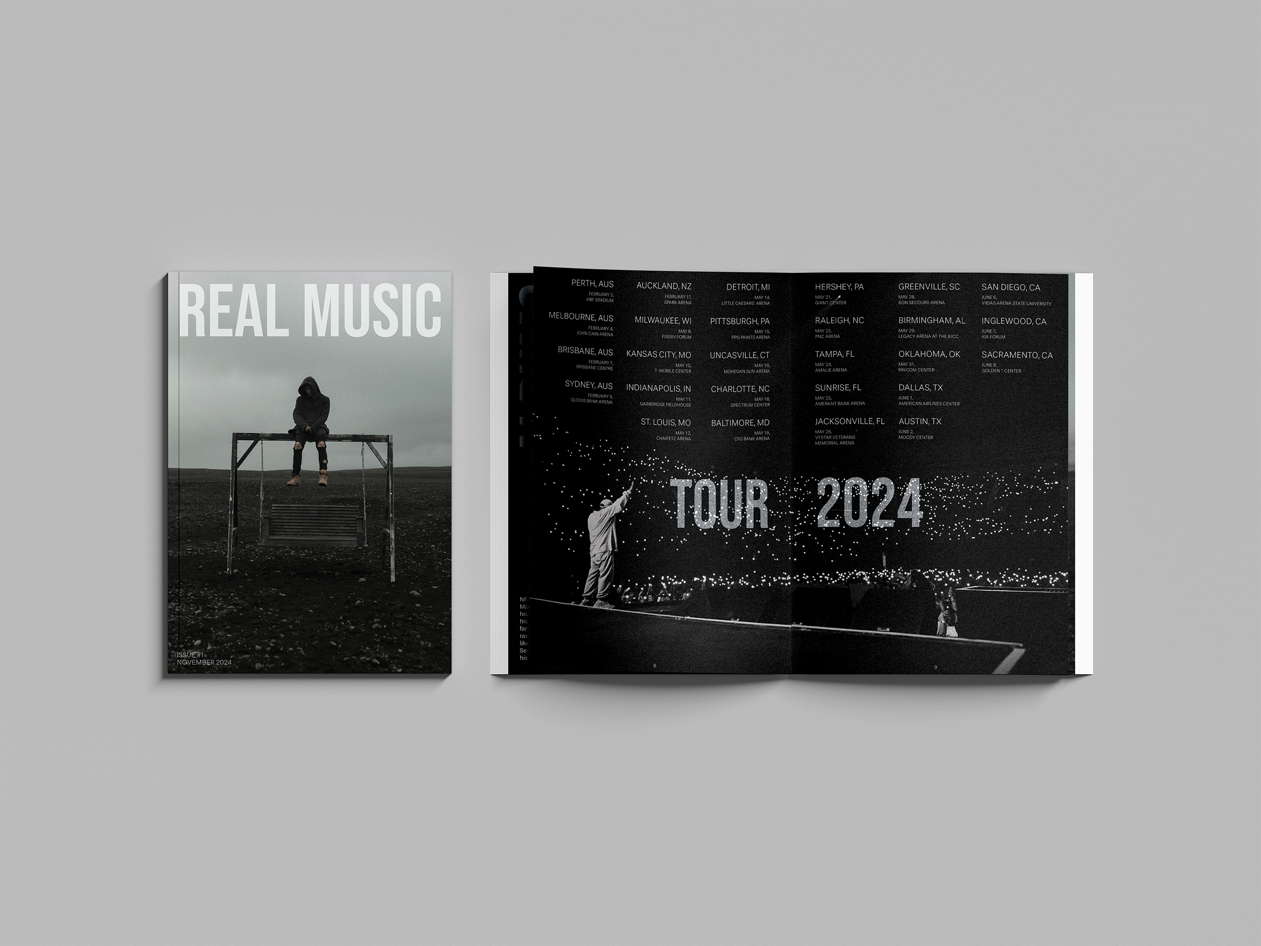
My first step in designing the magazine was defining its fonts and color scheme, drawing inspiration from NF’s minimalist aesthetic seen across his music videos, album covers, and social media. I chose a black, white, and blue-accented palette and selected Stevie Sans Light for body text and subheads, paired with Bebas Neue Regular for bold titles. I prioritized simplicity and legibility in body text, while allowing titles to be more visually striking. Influenced by my own preferences and design research, I focused on strong visual hierarchy, impactful full-spread imagery, and minimal text. I also used small, unobtrusive page numbers to maintain the immersive experience. Where possible, I balanced image-heavy spreads with substantial written content on adjacent pages. The design system extends across posters, signage, and merchandise, always maintaining clarity and adaptability.